A First Look Into It
Sometimes a visual is needed to look at outcomes or consequences with doing any calculations. This visual is pulled out of a list of numbers, called 'coordinates' and put on a paper with grids on them. Grids are lines drawn on paper where on set of lines are vertical and equidistant from each other and another set of lines are horizontal and equidistant from each other. One line on each of these set of lines pass through a point called the origin and are called axis, usually X for the horizontal and Y for the vertical. This origin is where both lines passes through a point where they both have 0 as a value and is usually taken as the beginning point for calibration.
It is important to tell you there are also 3- dimensional graphing. This graph includes a Z-axis.
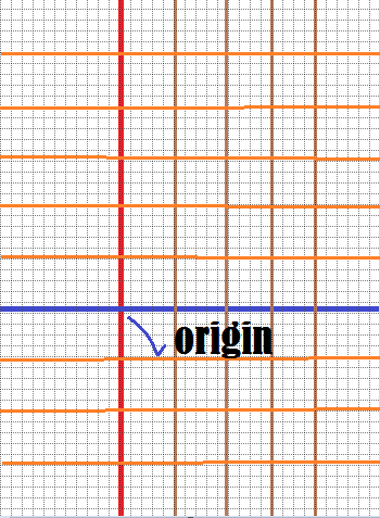
Of course there are other types of graph papers where the the grid lines are not equidistant from each other or even straight but these are not inside the scope of the present write-up. The horizontal and vertical lines both start points from the same point called the origin. Now these particular set of lines have a thick line after every four and you may indicate the horizontal lines on the lines both horizontally and vertically where you can place values using some 'interval' For example, you could place a number incremented by 5 starting from the origin which you will place 0 at the those thick points. Look at the example below

The numbers don't have to have the same interval on both lines. The intervals will depend on the scale you intend to use. The lines are usually separated by 5 cm. So you indicate and use a certain interval or units to cover the 5 cm on each of the lines. For example you could say
X-axis: 5 units per 5cm
Points And Traces
To plot the graph, you use points that are selected from a listing called out of a statistic or an equation. After you set the scales and select points for X and Y-axis, you put them in small groups like so
(2,5)
(6,3)
(1,10)
(3,12)
For lessons in algebra which may be useful in learning Graphs go to: Simple Algebra
The first number is an X-point and the second number is a Y-point.point. Lets use the first three points and use a one-to-one scaling.
(2,5)
(5,3)

Now you join those points together following them as they appear on you line-up because that is how they were mapped. This means that (1,0) is joined first to (2,5), then (2,5) is joined to (5,3) and so on...

One After The Other Or All The Way?
There are times you are given or use a set of points that are related by simply taking out stuff like say I ask you kindly: "get me the age of every father i your street and the number of his kids, so we see if 'father-age' somewhat relates to 'kid-no'. You strut off like a penguin with no idea of what's gonna really happen to go get me the statistic.
There are times you are presented with an equation or a situation where something changes like 'temperature variation' in a large room. In such cases the resulting graph will look more like a 'curve' that looks like a rope or snake coiling.
You can clearly see that we used straight line segments to connect between them point, ha? But that does not mean that how actually works all the time. Well, the truth is, you could say that sometimes those connecting lines have to be between very near points like between 2.1267cm and 2.12672cm. Now see how close that is?
When you have these kind of small line segments, you end up drawing a curve.
Tables For Keeps
In other to gather info, to use on your graph paper, you need to a way to record it orderly. One simple way is to use a table. A table is an ordered merge of values in rows and columns that really shows the relation between some chosen sets of data. These sets are named and the name of each set is normally placed as heading for each column in the table.
Lets use an example to show what a table is:
A man collects the age of the 10 fathers in his street and the number of children each father has and tabulates them.
| Father Name | Father Age | Number of Kids |
| Jake | 40 | 3 |
| Dale | 28 | 1 |
| Adele | 32 | 2 |
| Tad | 20 | 1 |
| Jones | 40 | 4 |
| Kenneth | 45 | 3 |
| Collins | 28 | 2 |
| Police-Guy | 48 | 4 |
| Bank-Guy | 38 | 5 |
| Dale | 26 | 1 |
More lessons related to connecting lines between sets of coordinate: Vectors
If you try to plot this graph, you get the points below. You can tell that guys with more age tend to have more children. If you try to join the points from the least number of children it won't be a straight line, but it will be a line indicating that children add up as parents grow older

Curves
Some graphs are joining of straight line segments between points that are far from each other. But some are 'continuous' lines that have their points very close together. Basically, the reason can be the grapher's choice due to some criteria like whats on ground or if he has a computer or the time to make a stretchy issue. However, curves are usually drawn using equations like a quadratic, elliptic or any polynomial equations among other or it might look curvy if you can find very near-points for your x and y mappings. Curves come out like snakes, coiling but always seeming to have an exact two- or three-value for every relation you check.
Tangents to Curves
Grams and Charts
There are graphs for statistical calculations like below"
- Histograms
- Bar Charts
- Multiple Bar Charts
- Component Bar Charts
There are also pictograms and even actual maps of geographical regions. These are all graphs
Look And Tell
You can use a graph to tell whats going on in a situation if you are qualified. For instance the graph below shows that things are well. But it first told us that all was not so well.

Y = 3X3-4
Use a scale of 5units to 5cm for X-axis
and a scale of 10units to 5cm for Y-axis
You can get further lesson on line drawn figures and shapes: Lines, Triangles, and Circles and more math lessons at: Math
No comments:
Post a Comment